Scaling Real-Time
Coordination Systems.
A driver/valet, customer and the admin operations into a single coordinated system, cutting ticket resolution time and rebuilding trust at stadium scale.
TL;DR
Valet, Customer and admin lacked coordination causing race conditions, lost tickets, and customer parking panic. I led the design of a unified real-time valet app, a customer app, and admin dashboard sharing one platform. Piloted at a 9000 car capacity with measurable drops in panic reports and ticket resolution time.
Role
UX Lead · Scrum Master
Team
2 Designers · 2 Fullstack Eng · 2 Django Eng
Timeline
6 Months
Platform
Valet App · Customer App · Admin dashboard
Stack
Figma · Django · Jira · Maze · VS Code
Impact
−60%
Parking Panic Reports
−42%
Ticket Resolution Time
200+
Live Data Points
Problem Framing
Three screens, one lot, zero coordination.
Valets, dispatchers, and managers were operating the same physical lot through three different tools, none of which shared state. The result was systemic: customers panicked, parking wasted and the admin dealt with bad data.
Context
Valet parking at scale for large venues & stadiums
High-volume pre & post-event traffic created major bottlenecks in vehicle retrieval, causing delays, confusion, and customer frustration during drop-off & pickup operations.
User Problem
Customers couldn't trust
Post-event retrieval averaged 45mins. No live status meant customers panicked and called managers, who also had no status.
Business Problem
Every dispute cost more than the booking.
Disputes took 50% more than average time to resolve because no system held a unified event timeline.
Constraints
To work within
- Peak demand within a 30 - 45min wondow
- First pilot with no established workflows
- Coordinating multiple parking zones simultaneously
- Deadzones in the parking lots
Objectives & Success Metrics
What win-win means for users and the business.
User Goals
- · Know where my car is, without asking.
- · Retrieve in under 5 minutes from the request tap.
- · Recover gracefully when phone dies or signal drops.
- · Trust a wrong-car handoff is impossible.
Business Goals
- · Win the stadium pilot contract.
- · Cut dispute resolution overhead by >50%.
- · Operate at 4× efficient with same headcount.
- · Generate auditable event log per vehicle.
Success Metrics
| Goal | Metric | Result |
|---|---|---|
| Reduce retrieval friction | Avg retrieval time (tap → keys) | 18mins(60% reduction) |
| Rebuild confidence | "Where's my car" reports | −60% panic reports |
| Admin assistance | valets & drivers complaints | -28% (Reduced) |
| Operational visibility | Live data points in admin | 200+ live data points |
Research & Insights
I optimized for what valets actually do, not what they told us.
Methods
Field Shadowing
3 shifts across 3 venues, peak & off-peak.
Operator Interviews
5 interviews with valets, drivers, admin.
User journey mapping
Mapped the end-to-end journey from booking and vehicle drop-off to post-event retrieval.
Usability (Maze)
6 participants across 4 unmoderated rounds.
Key Insights
Insight 01
"Valets optimized for certainty over speed."
Speed came from removing confirmation anxiety, not removing taps.
Insight 02
"Customers calmed the moment they saw any status."
Visible status reduced the panic irrespective of speed of retrieval
Insight 03
"Managers used Excel because dashboards lied."
Legacy dashboards aggregated stale data. Managers trusted their spreadsheet because they controlled the refresh.
Design Direction
Simplifying coordination during peak retrieval periods.
Research showed that most operational failures happened after events ended, when thousands of guests requested vehicles within a short time window. Staff struggled to coordinate retrievals, while customers had little visibility into wait times or vehicle status.
Key Problems
- • No centralized view of active retrieval requests.
- • Manual coordination caused delays and duplicate work.
- • Customers had no visibility into pickup progress.
- • High post-event demand created operational bottlenecks.
Design Priorities
- • Reduce confusion during vehicle retrieval.
- • Improve coordination between valet teams.
- • Surface real-time status updates for customers.
- • Support high-volume event operations.
Product Direction
The solution focused on creating a shared operational dashboard for valet staff and a simplified status experience for customers, helping both groups stay informed during peak retrieval periods.
Exploration & Iteration
Three concepts. Two I killed.
A
Killed
Chat-based dispatch.
A Slack-style channel where dispatchers messaged valets directly with retrieval requests.
Why It Failed
Valets ran with phones, couldn't read or type. Speech-to-text failed in 90+ dB noise. Worse: preserved the "two screens, one truth" problem instead of solving it.
B
Killed
Customer self-locate map.
A live map showing exactly where the customer's car was parked, with walking directions.
Why It Failed
Solved the wrong problem. Customers didn't want to walk to their car, they wanted it brought to them. Beautiful, but engineered around an unvalidated assumption. Killed at concept review.
C
Shipped
Shared event log + role surfaces.
One backend event stream. Three UIs (customer / valet / admin) each projecting the same truth differently.
Why It Won
Solved coordination at the data layer, not the UI layer. Every other problem reduced to "is the log right?" a question answerable with logs and tests. Scalable to future roles without redesign.
Final Solution
Three surfaces. One log. Sub-2-second sync.
Each role gets a tool shaped to its environment — but every action writes to the same event log. The admin sees the same truth the valet just created, in the same second.
Admin Dashboard
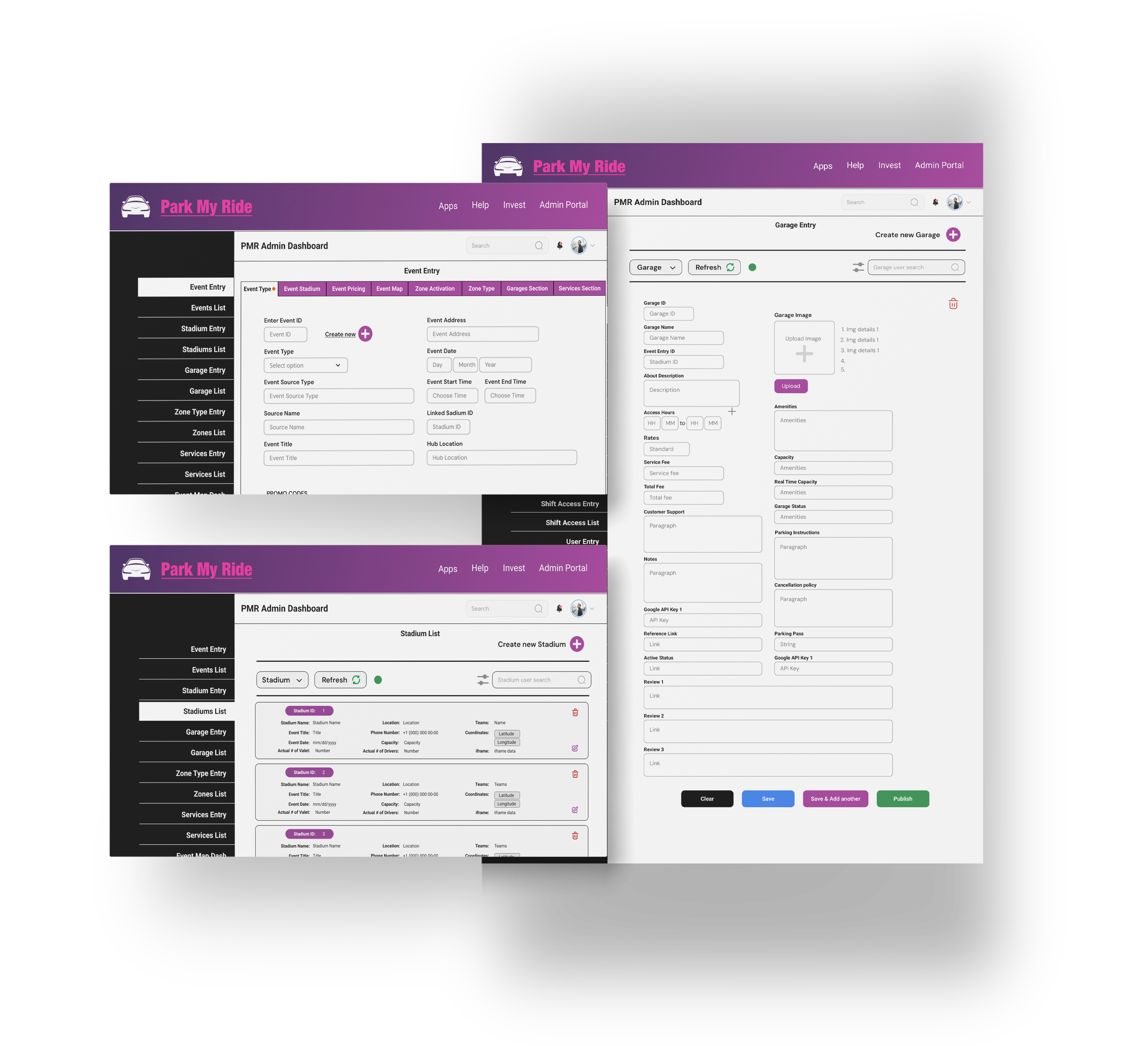
What
Managers needed audit-grade visibility across 26 screens and 200+ data points without losing the at-a-glance read for surge mode.
Behavior Change
Managers stopped maintaining shadow spreadsheets. The dashboard became source of truth.
Valet App
What
High-contrast UI with 64px hit targets and haptic confirmation. Designed for running, gloved hands, dead zones.
Behavior Change
Intake cycles dropped to 43 seconds; valets stopped re-confirming plates because confirmation became haptic.
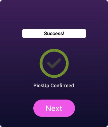
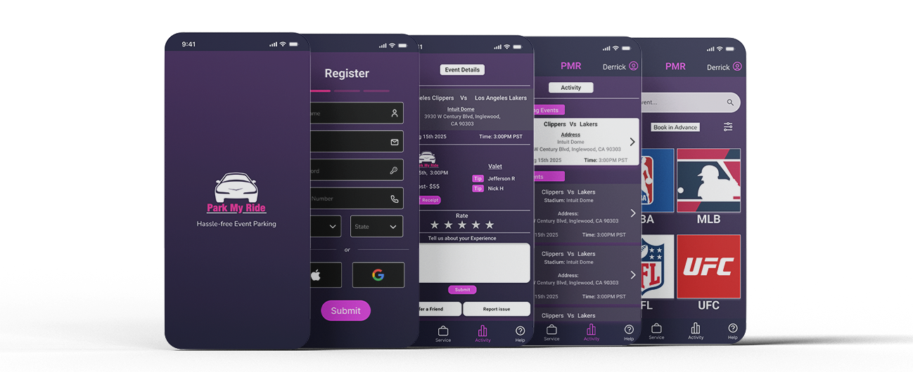
Customer App
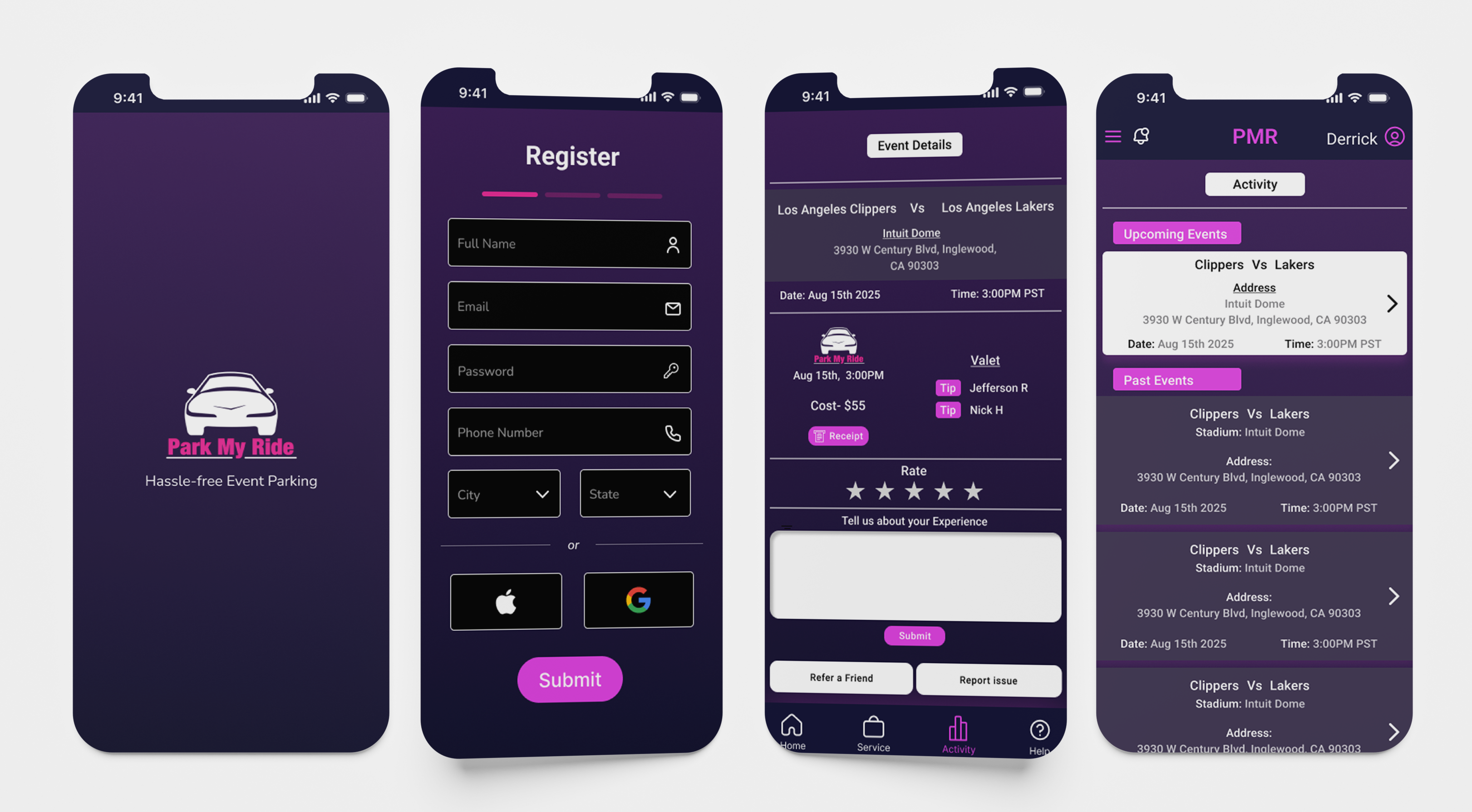
What
Status visible by default, even when nothing was happening, the customer saw what was happening. Silence was the bug.
Behavior Change
Retrieval became a one-tap action; panic calls dropped 60%.
Edge Cases Shipped
Beyond the bare minimum
A pilot at a 65,000-seat stadium produces failure modes a workshop never will. Each of these shipped before the pilot and was observed in the wild.
The double-park.
Two valets accept the same retrieval inside 400ms. Event log resolves via monotonic timestamps; second valet sees "reassigned" immediately.
Race Condition
Phone dies mid-shift.
Ticket lives on server, retrievable by plate. Manager-side recovery in 8 seconds. Built because it happened week one.
Device Loss
Wrong car retrieved.
Plate mismatch triggers a hard-stop full-screen confirmation; logged critical and surfaced to admin in 2 seconds.
Liability Guard
WiFi collapse.
Cached QRs valid offline 4 hours. Retrieval requests queue locally and fire on reconnect.
Network Failure
Systems Thinking
Built so the next role can plug in without a redesign.
Multi-User Workflows
Three roles, one source of truth. Success relied on the sub-2-second handshake between mobile field tools and live operational dashboards.
Scalable Data Handling
Discussed architectural shifts from Django to more efficient database handling to manage increased API load as event volume scales.
Design System: Figma Tokens
Spacing, color, semantic warning states exported to JSON. Touch-target changes propagated to engineering specs without translation loss.
Component Logic
Built reusable "status surface" and "destructive-confirm" patterns. Adopted across all three surfaces, one component, three contexts.
Future Extensibility
Patterns generalize to concerts, sports, multi-event lots, and future roles (insurance auditor, venue ops) no new schema required.
Accessibility (WCAG 2.1 AA)
Field layouts pass AA contrast; 64px high-visibility interactive surfaces for quick, error-free taps on dark stadium lots.
State Management
Optimistic UI on the valet app with server-resolved reconciliation. Conflicts surface as state changes, never silent overwrites.
Cross-Platform Consistency
Same token system, same semantic states across iOS field tools and web admin. One mental model across roles.
Collaboration & Tradeoffs
The hard calls and what we gave up.
I led both UX and Scrum ceremonies. Trade-offs surfaced in standup, not retros and got resolved against the pilot deadline.
| Constraint | Decision | What We Gave Up | Outcome |
|---|---|---|---|
| Django realtime limits | Polling + targeted websocket on critical events | Full live-sync on non-critical UI | Sub-2s sync where it mattered; shipped on time |
| 6-month pilot deadline | Cut vehicle inspection module from MVP | Liability surface area | Documented as P0 post-pilot; manual bridge in place |
| Ops wanted speed, finance wanted audit | Event log satisfies both: speed at UI, audit at data | Some duplicated logging effort | Both stakeholders signed off on pilot scope |
| Two designers, six engineers | Ran Scrum to keep design ahead of dev by one sprint | Some exploratory design time | Zero spec-blocked sprints across the project |
UX + Scrum Master
Holding both roles compressed the spec-to-ticket loop. JIRA ceremonies stayed in sync with Django velocity because the person grooming the backlog was the same person designing the screens.
Outcomes & Impact
Pilot results, and what they unlocked.
Quantitative
−60%
Parking panic reports during peak events.
−42%
Ticket resolution time (dispute → resolved).
200+
Live data points surfaced in the admin dashboard.
Qualitative
"Having access to data post event is very helpful to strategise for the next shift."
— Role, Stakeholder
"Instead of relying on radios, mobile app with personalized updates was refreshing."
— Valet, Pilot venue
"The process was much less chaotic in this huge crowd, I could see my car is on the way and exit the building timely."
— Customer, post-pilot survey
Reflection
What I'd do differently.
What Worked
- · Solving coordination at the data layer, not the UI layer.
- · Research and data backed decisions helped focus on the core friction points.
- · Maze testing for mobile apps and A/B testing for admin dashboard validated the designs early in development stage.
What Didn't
- · Spent too long on chat-dispatch before field-testing it in noise.
- · API bottleneck due to high referesh rate & realtime updates to multiple users.
- · Network dead zones in deep parking areas was not considered initially.
What I'd Improve
- · Validate concepts in environment (noise, weather, dead zones) before usability lab.
- · Build dashboard refresh-rate guarantee into the design spec, not the eng spec.
- · Ship a smaller "trust loop" version first, even before unified log was ready.
Future Opportunities
- · Vehicle inspection module (deferred from MVP).
- · Multi-venue zone-handoff for citywide event nights.
- · Insurance auditor role plugged into existing event log.
- · Predictive surge-mode triggered by ticketing API, not load.