Concert Buddy
Designing a smarter, more social concert-going experience
Project Overview
Concert Buddy is a mobile application that empowers concert-goers to plan events, coordinate with friends, and capture memories seamlessly. Our team of five tackled this challenge over a 9-week sprint with a focus on personalized and group-based user journeys.
Challenge
Planning concerts with friends is chaotic. From discovering shows to organizing logistics, Concert Buddy aims to centralize and simplify this experience for users.
Goals
• Streamline the concert discovery and planning process.
• Enable group coordination and shared memory capture.
• Provide contextual, real-time insights and reminders.
Results
5 of 6 users successfully completed tasks. Most users found the process intuitive and appreciated the app’s focus on personalization. The early results validate the core concept and provide clear next steps to improve user trust and event partnerships.
Design Process
- Discovery: user interviews, affinity mapping, and persona spectrum development
- Design Phase I: moodboards, information architecture, and wireframes
- Testing Phase I: observational testing, AEIOU framework, priority matrix
- Design Phase II: visual system, high-fidelity prototyping
- Delivery: Figma prototype, team report and documentation
Discovery Phase
Inductive Coding
We Conducted 10 user interviews collectively as a group. The goal of the interviews was to dive deeper into the concert experience and find the pain points and user needs. We asked specific questions related to the artists, the venues, and the overall environment.
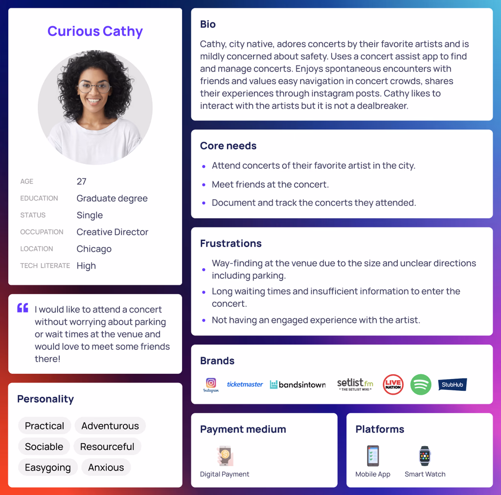
Persona identification
Based on the demographic and user action data, a persona spectrum was created to identify the most relatable persona for the product.
User Journey Mapping
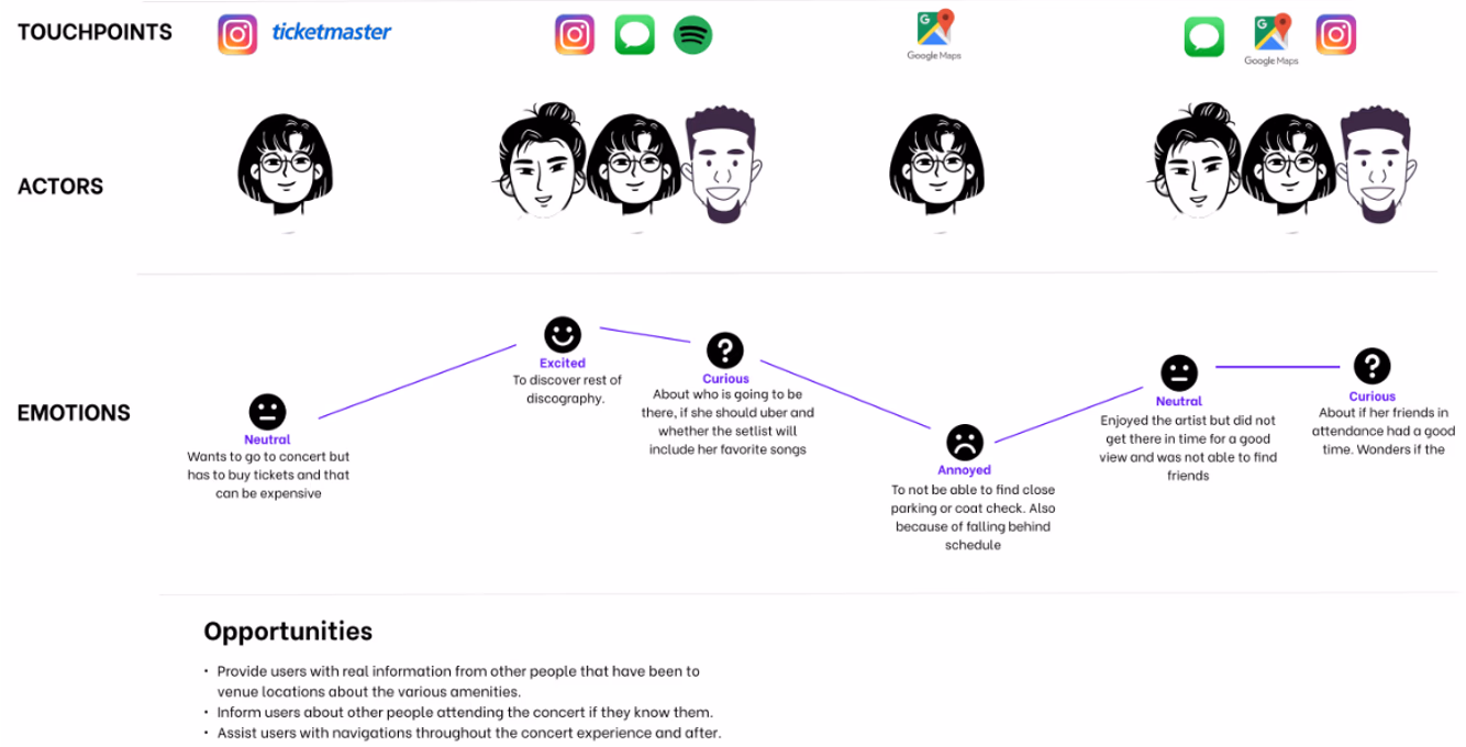
Based on the interview data and conversations with the users, we created a Customer Journey map with emotional state of the customers mapped at different stage in the process while documenting the touch points and made note of opportunities.
Competitive analysis
We carried out a competitive review to find where our platform could fit in the market. The main competitors we identified were Concert Archives and POSH. We also compared our idea with ticketing apps such as TicketMaster and music apps such as Spotify.
To analyze the customer reviews collected from the PlayStore and AppStore review sections, we used ChatGPT 3.5.
The AI tool helped provide us with insight into what features the users like the most. Limited social interaction,
for example, was one of the main complaints based on user reviews. Based on this information, our team was able to
get a better idea of what our target users are looking for.
- Must: Personalized concert discovery, group coordination, memory timeline
- Should: Real-time alerts, post-concert sharing features
- Could: Venue ratings, fan meetups, public photo albums
- Won’t: Ticketing integration (deferred for future phases)
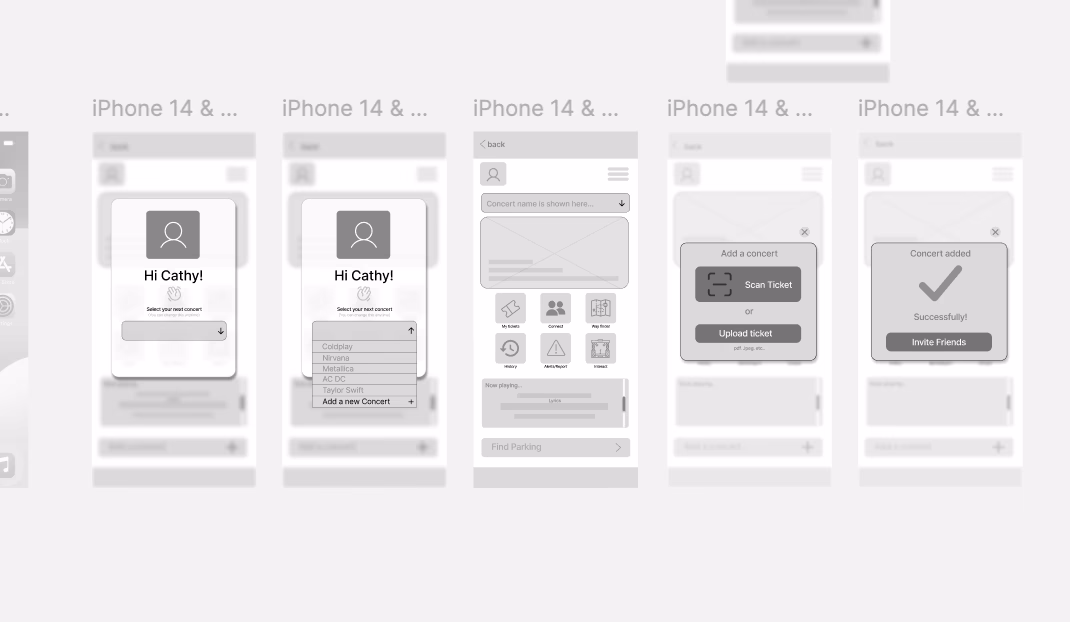
Design Phase - I
Based on the persona and the high priority tasks identified, Scenarios and Task flows we created and which then converted to mid-fi prototype for testing.
- 5 out of 6 users successfully completed all core tasks
- Users appreciated the group planning feature and visual event cards
- Feedback led to improvements in navigation flow and confirmation prompts
- One key pain point was visibility of shared tasks during event planning
Testing Phase - I
We conducted a Cognitive walkthrough with 5 skilled UX designers which resulted in the following 4 major recommendations.
- Add a confirmation screen with ticket details after scanning.
- Allow quick venue info access (e.g., bathrooms) without full app flow.
- Clarify terminology 'Save Memories' feels more engaging than 'Archive Photos.
- Show the artist/concert name in the review flow and clarify review categories upfront.
Testing Phase - II
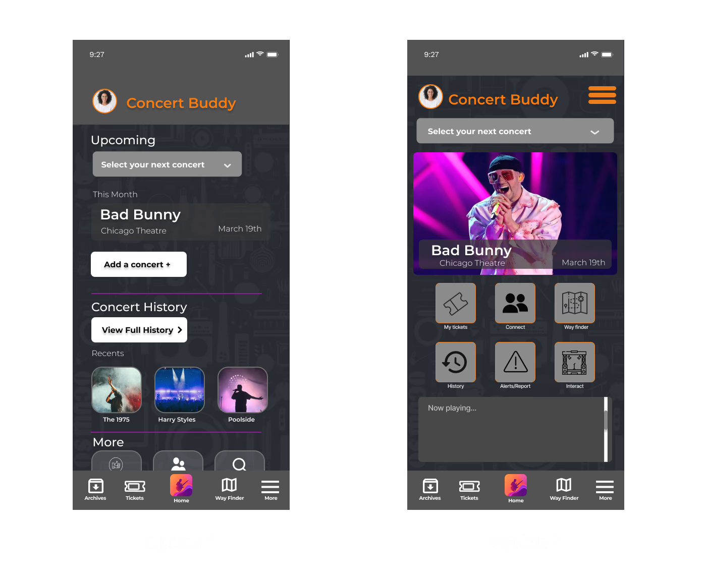
A/B Testing Concert Buddy Home Screen:To determine which home screen design (Option 1 vs Option 2) better supports users in seamlessly planning and enjoying their concert experiences.
- Participants: 6 users frequent concert-goers
- Device: Mobile (iOS and Android)
- Method: Remote usability testing
Key findings: Option 1 is better for basic tasks and Option 2 drives higher engagement.
Retrospective
We identified one limitation of our study is the relatively small sample size for certain research methods, such as the card sorting activity and usability testing. While these methods provided valuable insights, the results may not be fully generalizable to the broader population of concertgoers. Additionally, the informal nature of the usability testing will have introduced biases or inconsistencies in the feedback which will be provided by participants. These limitations should be considered when interpreting the results of the study.